Work Type: Branding
The old logo First what we didn’t want to do. After much study, we realized the identity cannot be of depicting concrete structure. The brand is more than just concrete structures, future is endless. We wanted it to look distinct from competition. It is a serious business. The logo should bring in trust and experience. […]
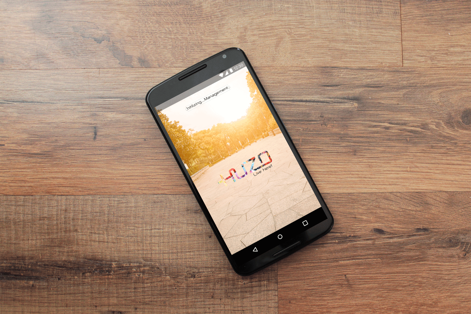
Back in 2015, I had the chance to work with Rahul and his team on Zoowimama, a cool local discovery app born right here in Bangalore. As their designer, I was all in—crafting the brand’s identity, diving into UX research, designing the app UI, and bringing it all together with a detailed brand guide. From […]


